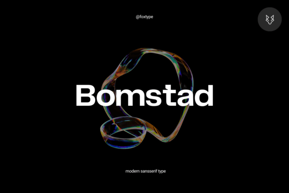
Bomstad: A Modern Sans Serif Typeface for Digital Clarity & Charm
It started with a hero section—just me, a half-finished coaching website, and a banner image that felt too quiet. I’d been using a safe, familiar sans serif for headlines, but the message lacked presence. So I swapped it in: Bomstad. Not the lightest weight, not the boldest—just Regular at 48px over a soft linen-textured background. Instantly, the headline didn’t just sit there—it breathed. It anchored the space without shouting, added warmth without sacrificing polish, and gave the whole layout a grounded, intentional feel.
What Bomstad Brings to the Screen
Bomstad is a modern sans serif typeface built for impact and elegance—not austerity. Its letterforms balance geometric precision with subtle humanist touches: open counters, gently tapered terminals, and consistent stroke contrast that gives depth without heaviness. It’s not cold or clinical like some ultra-minimal fonts, nor does it lean into trend-driven quirks. Instead, Bomstad feels quietly confident—like a well-tailored jacket you reach for because it works, every time.
I tested it across real web contexts: a boutique online store’s product banners, a course sales page’s key benefit statements, a portfolio site’s project titles, and even a blog’s featured post headers. In each case, Bomstad elevated hierarchy without demanding attention. Its 9 weights—from Thin to Black—let me fine-tune emphasis precisely: Light for delicate subheads, Medium for section titles, Bold for primary CTAs, and Black for hero statements where visual gravity matters most.
How It Performs in Responsive Layouts
One of my first real-world checks was mobile. I applied Bomstad Bold (32px) to a landing page headline on an iPhone preview—and it held up beautifully. No blurriness, no awkward spacing, no “crunching” at smaller sizes. The x-height is generous, ascenders and descenders are clear but restrained, and character spacing remains balanced across viewports. On tablets, I used SemiBold for feature cards; on desktop, Black for hero text layered over imagery. In every case, readability stayed high—even over textured or gradient backgrounds.
Where Bomstad shines most is in controlled, intentional typographic moments: hero sections, section dividers, call-to-action buttons, and branded quote blocks. It’s not designed for long paragraphs or dense interface text—but that’s by thoughtful design, not limitation. For body copy, I paired it seamlessly with a clean, highly legible sans serif (like Inter or Manrope), letting Bomstad handle voice and personality while the companion font handled function and flow.
Real Pairings That Work—Without Overcomplicating
Font pairing isn’t about rules—it’s about rhythm. With Bomstad, contrast is your friend. Its modern, structured silhouette pairs naturally with:
- A neutral, highly readable sans serif (e.g., Inter, Lato, or even system fonts like -apple-system) for body text, navigation, and forms;
- A warm, low-contrast serif (like Cormorant Garamond or Literata) for editorial blogs or brand storytelling sections;
- A restrained script (not overly flourished) for accents like “handcrafted,” “limited edition,” or signature lines—used sparingly.
I avoided pairing Bomstad with other high-contrast display fonts or decorative serifs—they competed instead of complemented. But with simplicity as the foundation, Bomstad became the memorable, ownable voice of the brand—without ever feeling forced.
Webfont Readiness & Practical Considerations
The included webfont files (WOFF2, WOFF) loaded quickly in real browser tests—even with multiple weights. I served only the weights I needed (Regular, Medium, Bold, Black) via @font-face, keeping the total payload under 120KB. No FOUT or FOIT hiccups. Kerning and ligatures were well-hinted, and the OpenType features—including stylistic alternates and figure sets—gave flexibility for refined details when needed (like lining vs. old-style numerals in pricing displays).
Multilingual support covered Latin-based languages thoroughly, including accented characters common in European markets—essential for any global-facing site. And crucially, the commercial license clearly permits use on client sites, SaaS dashboards, e-commerce platforms, and digital templates—no ambiguity, no surprise restrictions.
Where Bomstad Fits—and Where It Doesn’t
Bomstad excels where clarity meets character: hero headlines, section titles, product names, testimonial quotes, CTA buttons, and branded graphics. It adds sophistication to a portfolio, trust to a service page, and distinction to a product landing experience.
But it’s not meant for everything. I avoided it for:
- Small navigation labels (<14px) — its charm gets lost, and legibility dips;
- Form inputs and error messages — functional typography needs neutrality first;
- Dense dashboard tables or data-heavy interfaces — here, monospaced or ultra-legible sans serifs serve users better;
- Long-form blog content — stick with a proven body font for sustained reading comfort.
That restraint is part of what makes Bomstad so effective: it knows its role. It doesn’t try to do everything—so when it appears, it means something.
Final Takeaway: A Typeface That Supports, Not Distracts
Bomstad isn’t flashy. It won’t dominate your design system—but it will elevate it. It’s the kind of sans serif typeface that feels like it belongs: in a modern coaching site’s welcome message, a boutique store’s new collection banner, or a course creator’s launch page headline. It brings cohesion without rigidity, warmth without fuzziness, and distinction without distraction.
If you’re choosing a display font for digital work—especially one that must balance brand voice, responsive performance, and real-world usability—Bomstad earns its place not as decoration, but as a thoughtful, reliable design partner.